Grey Walls Kill Sex and Other Myths
Just the color of the room can play a huge role in how we feel and act. Paint the walls blue, and studies show you may be more creative. Paint them red, and you may be more vigilant or more sexy. Change to green to calm yourself down. But if you really want something off the wall, paint those walls a certain shade of pink.
I call Bullshit.
This is a quote from a CBS News segment posted online last year.
They are hardly the first to make such claims. My husband, who is an art director by trade, was taught many of these myths as fact in his color theory course at Savannah College of Art and Design. You can find claims like these in books, magazines (including self-described science-based magazines), and all over the internet. They are so ubiquitous that I made the effects of color on emotion my first research project as a psychology undergrad, then continued the work for more than a decade, including a Master’s thesis on the topic. 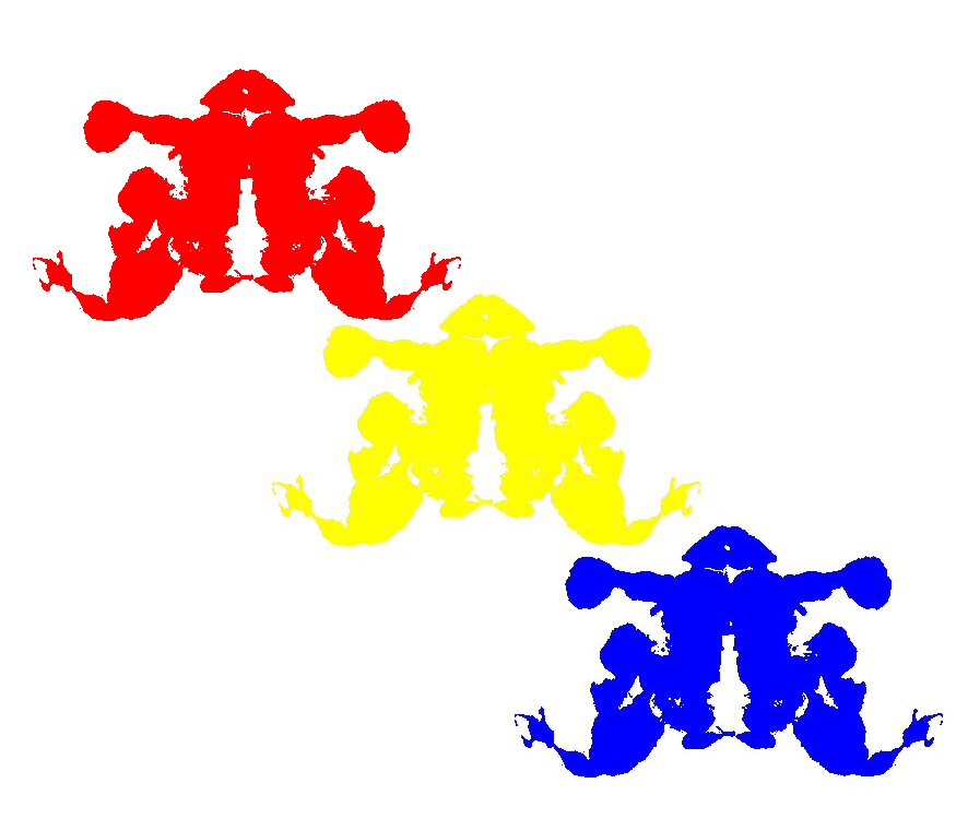
But 95% of them are bullshit.
What you’ll find when you look up the sources cited (if there are any) for most of these claims is usually a book written by a man named Faber Birren, which includes a list of citations of journal articles, most of which were written by him. And what you’ll find when you read these articles is that his research methods are seriously, seriously flawed. In fact, most research on color is seriously flawed, usually because the researcher(s) failed to consider the anatomy of the eye and the very meaning of “color”–what it is and how it is produced. One need not earn PhDs in physics and physiology, but some basic knowledge of the visible light spectrum is needed, as is an understanding of the way cells in the retina are structured.
I won’t go into those things here, of course, but I will warn you that once you’re armed with that knowledge, a lot of these claims don’t make much sense.
When I set out to study this problem all those years ago, I noted three fundamental challenges that most researchers failed to meet:
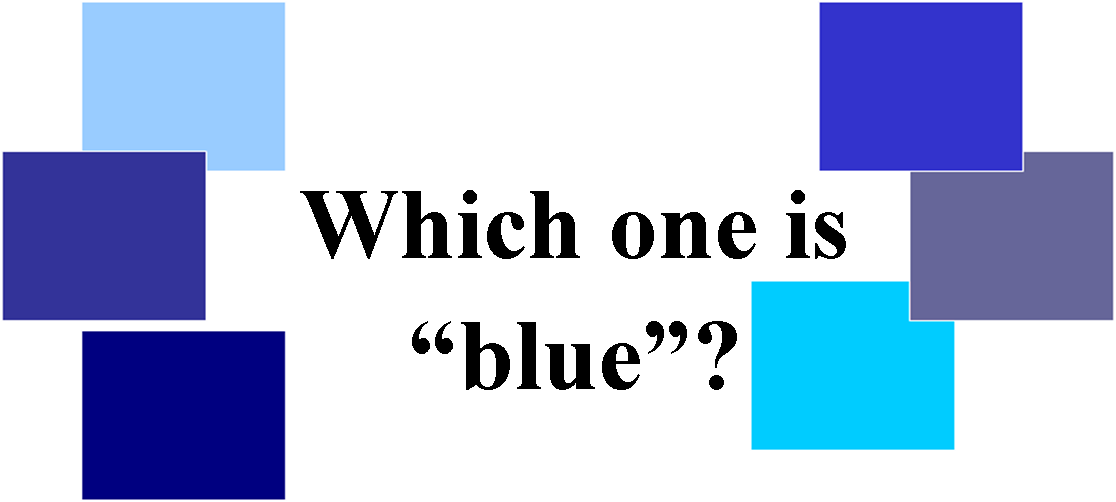
- Defining colors: Much of the older research uses simple terms like “blue” and “red”, which ignores properties of color such as saturation and brightness. There is no way for another researcher to replicate a study without very specific information about the colors used, how they were produced, and how they were displayed. It is also rare in the literature to find control of ambient lighting.
- Defining emotions: Emotion is not as simple as most of us tend to think. For example, think about what “grief” means to you. Is it a quiet, calm feeling? Is it the urge to curl up in a ball? Or is it a loud, angry feeling–the urge to hit something?
- Eliminating alternative hypotheses for outcomes: This is perhaps the most important and most challenging issue for any research, but it is especially challenging in the social sciences. Much of the research on color fails miserably when it comes to eliminating other, more plausible explanations for outcomes. For example, in some studies, people were simply asked, “How does this color make you feel?” The participant then provides a cognitive appraisal that includes learned associations of the color with emotions. They think about what that color means to them and make a decision about it. That’s not an emotional reaction to color. It’s an emotional reaction to associations they have with the color.
Once I addressed these issues in my own research, my findings were fairly consistent across experiments and over time, even when I addressed them in different ways. If you are interested, you can find an explanation of some of my experiments here.
What’s more, what I found certainly does not support the vast majority of claims about how color affects emotion and it does not support most of what was stated in this CBS piece. Let’s look at each claim and compare them to what I found in repeated experiments.
Just the color of the room can play a huge role in how we feel and act.
Well, that’s just a presumptuous and vague statement and, in my opinion, it is simply not true.
Paint the walls blue, and studies show you may be more creative.
Uh, no. I’m not even sure where this one came from. I’ve never seen a study with that outcome and I’d be very surprised if there was one that couldn’t be ripped to shreds by a mild critique. Many of these myths seem to have sprung from cultural associations.
While I was studying the effects of color on emotion as a psychology undergrad, I studied cultural associations with color as part of a minor in anthropology. It’s a fascinating topic. Data from the original World Color Survey in the 1970s suggested that the more complex a society, the more colors distinct colors they recognized with different names. I suspected that their associations with color (e.g., red with anger) would follow a similar pattern. I used a wonderful tool called the Human Relations Area Files [HRAF] to search ethnographies for references to color associations.
My hypothesis was supported, but what I also found interesting was that associations for a few basic colors were very similar. Red was almost always associated with vitality of some sort, black with danger or evil, and white with goodness and purity. This would make sense, given that darkness can be dangerous and blood, which is essential for life, is red. However, as the colors moved away from these basic colors, the associations were more and more diverse. In some cultures blue was associated with calm, in some with energy.
Paint them red, and you may be more vigilant or more sexy.
This is perhaps the only claim that even comes close to reality. The findings of my studies have not always shown effects, but when they do, red is always the most arousing. It usually produces more arousal than yellow and blue. But “arousing” does not mean “sexy”. Sexual arousal is only one type, one context, of arousal. All arousal means is that your heart is beating a little faster than when you are not aroused (and there other physical, measurable responses).
Change to green to calm yourself down.
And this is where they totally blow it. Another consistent finding in my research is that green is often more arousing than yellow and blue. It sometimes not statistically different from red, in fact. It does differ from red in that it is usually rated as more pleasant (participants don’t know that they are rating a color).
When you understand the opponent properties of retinal ganglion cells, this makes sense. The idea that red is arousing while green is calming does not.
But if you really want something off the wall, paint those walls a certain shade of pink.
And this is where I have to laugh. As the piece notes, there are entire books written about “Baker-Miller Pink”, the shade of pink used to paint a set of prison cells because the warden was certain that the color was responsible for a calmer inmate population. The problem? No well-designed and replicated research supports this claim. Furthermore, given that pink is simply a light shade of red, this effect would contradict all of my findings.
But what you really want to know is how color affects emotions, right? You want to know what color to paint your bedroom walls?
Paint them any color you like.
You see, while I have found reliable differences in emotions due to hue (and sometimes brightness), the effects are fleeting. The human visual system adapts so quickly that once you’ve spent a few minutes, or even a few seconds, in a room, any effects the color had on your body are pretty much gone. In fact, when you’re paying attention to another person, a television, a computer screen, a task, or anything else, you’re no longer even processing the color of the walls.


[…] http://icbseverywhere.com/blog/2014/08/grey-walls-kill-sex-and-other-myths/ […]